Why I prefer log odds ratios.
Imagine that high school graduation rates went from 75% to 80% in Obama’s presidency, how impressive is that? In particular, how would it compare to these changes:
- 99.9% to 99.9999%?
- 94% to 99%?
- 45% to 55%?
- 1% to 6%?
I find the extremes to be a lot more impressive than the ones near the median, simply because the population which does graduate (or not) got multiplied by a larger factor.
dates <- as.Date(c("2009-01-01", "2016-01-01"))
rates_label <- c("Real", "Half", "High", "Low", "Extra High")
rates <- c(75, 80, 45, 55, 94, 99, 1, 6, 99.9, 99.9999)
graduation_rates = data.frame(dates=rep(dates, 5),
                              label=rep(rates_label, each=2),
                              rates=rates)
ggplot(graduation_rates, aes(x=dates, y=rates, color=label)) + geom_line()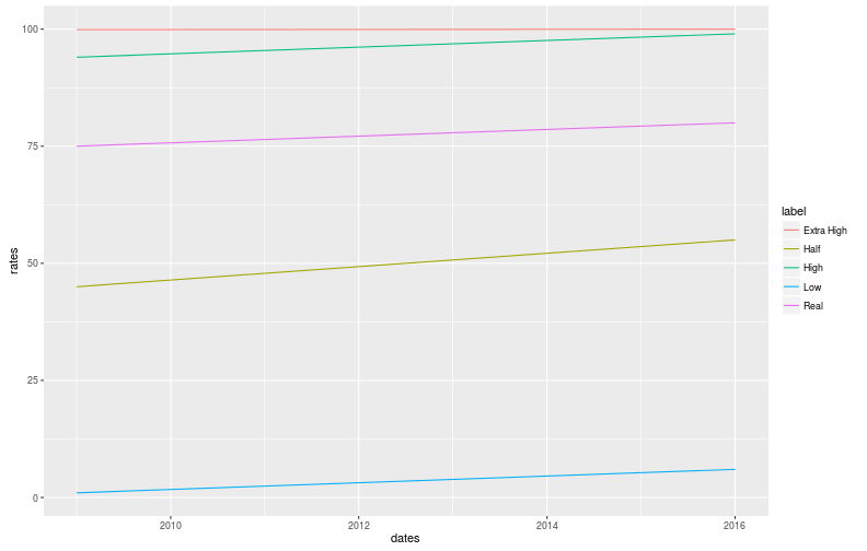
So how can we bring some math to this intuition? Well, the intuition comes from the fact that some population got multiplied (or divided) by some large factor. In the case of 1% to 6%, it’s the graduating population, for 94% to 99% it’s the dropout population.
Odd ratios are a nice way to measure that, they’re defined as odds of winning/odds of losing.
However, fractions are hard to compare, so we compute the values and compare them:
- 99.9% to 99.9999% becomes 999 to 999,999
- 94% to 99% becomes 15.7 to 99
- 45% to 55% becomes 0.82 to 1.2
- 1% to 6% becomes 0.01 to 0.06
For context, 0% is an OR of 0, 50% is an OR of 1 and 100% goes to infinity. Here are some plots:
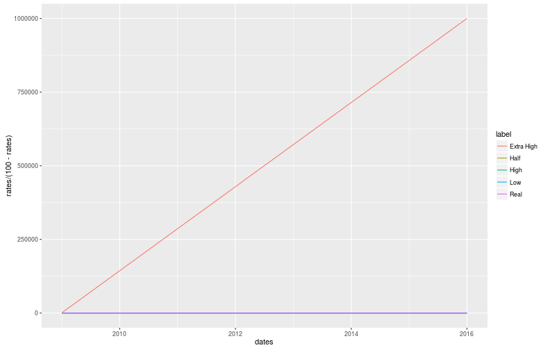
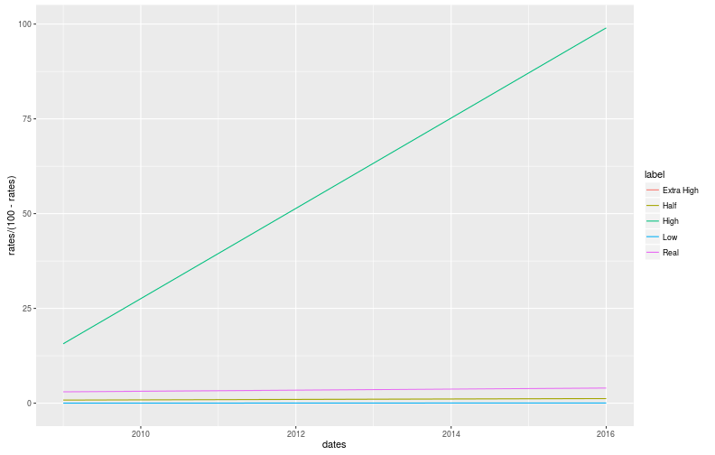
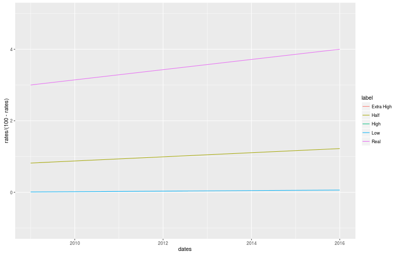
The Very High change is clearly very impressive, as expected, which is a good start. However, due to the huge range of values, these graphs are hard to read and we might as well stay with percentages. In addition, I would like both the High and Low changes to be as impressive as each other. In other words, I don’t want the non-graduation rate change to look more or less impressive than the graduation rate.
This is where the log comes in!
We simply take the log of the odds ratio.
We now have symmetry: log(a/b)=-log(b/a), this means that if LOR(50+a)=x, then LOR(50-a)=-x.
Again for context: 0% is -infinty, 50% is 0 and 100% is +infinity.
Plots!
ggplot(graduation_rates, aes(x=dates, y=log(rates/(100-rates)), color=label)) +
  geom_line()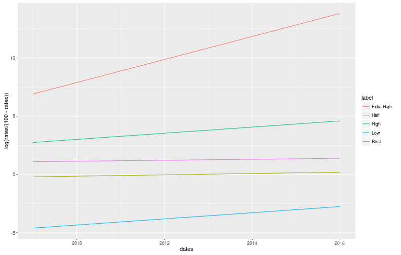
At first glance, this graph might not look impressive, but give it a chance. Before going any further, keep in mind that the impressiveness of a change of +1 is constant: going from 50% to 75% is comparable to going from 90% to 96%. This embodies the intuition we were trying to formalize.
Now, to the interesting features! First of all, the Extra High line swoops up, corresponding to a reduction of the dropout rate by a factor of 1,000, that is very impressive, but invisible in percentages, and overblown in odds ratios. Secondly, the High and Low lines have identical slopes: they both had a similar impact on graduation rate. Finally, the Half line is centered at 0, looking slightly more impressive than the real change, again corresponding to our intuition.
So which is actually more impressive?
Since the difference in log space might not yet be intuitive, I’m also going to compute the corresponding multiplying factor (exp(lor_diff)).
#I'm sure there is a prettier way of doing this, I'm still learning, sorry :S
lor_rates_2009 <-
  log(graduation_rates[dates == as.Date("2009-01-01"), ][["rates"]]/(100-graduation_rates[dates == as.Date("2009-01-01"), ][["rates"]]))
lor_rates_2016 <-
  log(graduation_rates[dates == as.Date("2016-01-01"), ][["rates"]]/(100-graduation_rates[dates == as.Date("2016-01-01"), ][["rates"]]))

lor_rates_diff <- data.frame(label=rates_label, lor_rate_diff=lor_rates_2016 - lor_rates_2009)
lor_rates_diff$factor <- exp(lor_rates_diff$lor_rate_diff)
lor_rates_diff[order(lor_rates_diff$lor_rate_diff), ]
## label lor_rate_diff factor
## 1 Real 0.2876821 1.333333
## 2 Half 0.4013414 1.493827
## 3 High 1.8435845 6.319149
## 4 Low 1.8435845 6.319149
## 5 Extra High 6.9087548 1001.000000Which now clearly corresponds with our intuition that the real change, and the middle change are fairly comparable, that low and high have equivalent changes, and that the very high is extremely impressive.
In addition to the nice things above, LOR are also great for extracting data from a biased sample. More on that soon!