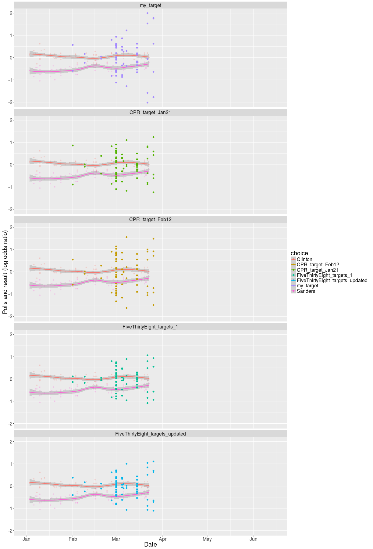
This chart seeks to satisfy some of my more particular desires in charts, as well as add a bit of information. I am only using the democratic primary race, due to a target analysis that is significantly easier to run in a 2-person race.
- better moving average (with std error!)
- plotting empty space for the future
- I don’t like percentages much, I significantly prefer log odds-ratio
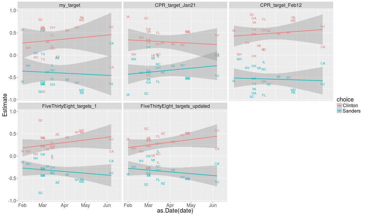
- plotting the state results after using targets to correct them for bias.
This doesn’t tell us much (yet!), but these new points probably tell us something about how the rest of the country is going to vote, assuming nothing changes.
Future predictions?
Using the prediction from the Huffington Post, we can see how this is going to play out in the future. This is to take with a huge grain of salt: not every state is here, and many of them have not been polled since the beginning of February, when a lot of Sanders press started coming out. In addition, every candidate underperforms in surveys, due to undecided voters, so expect everyone to do better than expected (especially Sanders). To correct for that, I take the LOR of the Clinton share to the Sanders share, which correctly averages around 0, this may or may not be a bad idea. States whose primary day is past have their estimate replaced by the actual results.