Targets - FiveThirtyEight edition
For a variety of reasons, I’ve wanted to move away from using the Cook’s analysis, and do my own.
Unfortunately, doing my own analysis requires a lot of time and data, both of which I lack.
However, FiveThirtyEight has a quick and dirty solution that I wanted to try out.
It boils down to white*liberal.
Unfortunately, they only charted 38 of 50 states, which makes it hard to do a national analysis.
This means I still have to do the number crunching…
This is not that bad however: great libraries allow the analysis of US Census Bureau data and the liberal-ness of a state can be measured from 2012 election results. These data slightly disagree with the FiveThirtyEight results, but I think it is close enough not to significantly matter. At the end of my analysis, I will compare my results to both FiveThirtyEights (hopefully nearly identical) and the Cook’s.
Why is this a good idea? Exit polls confirm that the more white and the more liberal groups are a Sanders-supportive group. It is dubious that the two variables are independent, allowing us to multiply them to get the amount of white liberals exactly. In practice, this is probably good enough of an estimate.
A note on estimates
Throughout this post, I will be doing a lot of “good enough” analysis, and not pushing it as far as I could. Some of it is due to a lack of time, knowledge and resources. But most of it comes from the fact that this estimate is inherently very hand-wavy. Trying to estimate down to the percent point (or .05 log odd ratio around the median) how many liberals there are, or how turnout affect racial groups differently, is trying to add precision where there is none to be gained. Think of it like trying to shoot an arrow blind-folded, but trying to calculate how the wind will affect the trajectory: it’s an interesting, but pointless, exercise.
Census data
The census data was obtained following the method described by Ari Lamstein. A huge thank you for providing surprisingly easy instructions to follow. I would write them here, but it would require publishing my API key, which I don’t really want to do.
state_demographics = read.csv("2010-state-demographics.csv")The data are already nicely formatted and everything, so that’s all we need to do! I’m really happy at how easy this was to obtain. :)
state_demographics$white_fraction <- state_demographics$percent_white/100
head(state_demographics[c("region", "white_fraction")])
## region white_fraction
## 1 alabama 0.68
## 2 alaska 0.64
## 3 arizona 0.59
## 4 arkansas 0.75
## 5 california 0.41
## 6 colorado 0.71These are going stay as fractions and not become log odds ratios quite yet, they need to be multiplied by the fraction liberals first.
Liberal data
Now, onto the political dimension! But first a few questions:
- Should I use more than the 2012 election?
At a quick glance, there doesn’t seem to be much change election to election, so the effects are probably small. - Maybe the midterms are better?
They suffer from a lower turnout, but so do the primaries, probably with a lot of overlap in who votes.
Regardless, I doubt these differences matter, just like the wind for the blind-folded archer.
It is surprisingly hard to find a state level data set for the 2012 election. I could find a few county-level ones, before finding an Excel spreadsheet published by Brookings. I spotted Vermont as being flipped and did a cursory check for the rest, let me know if you find any more errors? The third sheet (Presidential election) was then exported to a csv file.
pres12_results <- read.csv("2012-presidential-results-state.csv")
pres12_results$liberal_fraction <- pres12_results$Obama.Vote.2012/100
Multiply and conquer
Now, the long awaited multiplication.
sanders_scores <- data.frame(state=pres12_results$State,
                             score=pres12_results$liberal*state_demographics$white_fraction)
head(sanders_scores)
## state score
## 1 Alabama 0.26112
## 2 Alaska 0.26560
## 3 Arizona 0.25606
## 4 Arkansas 0.27750
## 5 California 0.24313
## 6 Colorado 0.36210For comparison, here’s FiveThirtyEights predictions.
# The csv file contains the Cook's targets, the popular vote and the date of the primary/caucus
dem_primary <- read.csv("2016-dem-primary.csv")
dem_primary$sanders_score <- sanders_scores$score

ggplot(dem_primary, aes(x=sanders_score, y=FiveThirtyEight_scores/100)) +
  #geom_point() +
  geom_abline(intercept = 0, slope=1, alpha = 0.5) +
  geom_smooth(method = "lm") +
  geom_text(aes(label = state.abb[match(State, state.name)]), size = 3)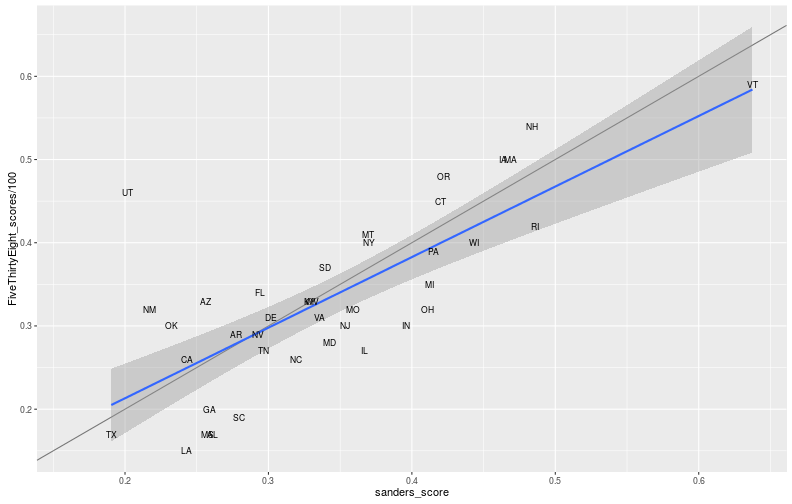
Great, we’re done! Or not, we have an indicator of friendliness, but not targets.
Targets: unexpectedly hard
So targets are how well we would expect the candidates to be doing if they were as popular (nationally) as each other. The percentages we have therefore need to somehow be centered around 50%. Anytime we’re shifting percentages around, something should immediately come to mind: log odds ratios. Except, there’s more to the story.
The scores need to be converted into expected results for equally popular candidates. Log odds ratio are a good way to compare popularity, so we’re going to use them. This is a bit tricky, simply shifting the LORs until they are centered at 0 does not end the story. Before going further ahead, another concern needs to be addressed: the states.
In this case, size matters, a lot. That was not obvious at first, but a slight change in the target for California’s 475 delegates is worth more than a similar one in Vermont’s 16 (after Wyoming’s 14, it’s tied with Alaska for second place). Next, states allocate delegates differently, winner takes all being particularly annoying. However, in terms of popularity measures, the aptly-named popular vote beats everything else, including delegate count.
All of this requires knowing more about the states: time to get data! To get state delegates, I will simply use the Cook’s estimates (they messed up DC, hence the manual fix).
dem_primary$total_delegates <-
  dem_primary$CPR_Clinton_Expected_delegates + dem_primary$CPR_Sanders_Expected_delegates
dem_primary[dem_primary$State == "District of Columbia", "total_delegates"] <- 20
Now, to the tricky part. Because I’m lazy, I’m not going to try to solve for the targets in each state. Instead, I’ll make my computer brute force the solution.
I’m going to define a function num_delegates(lors) and slowly shift up the LORs until it reaches half the delegates: 1,976.
The prettiest way to do this is to plot it and find the x-intercept (or rather, let the computer do that for us).
More efficiently, I’m going to use the bisection method.
This is going to be more than precise enough (arbitrarily so, in fact), it would be like the archer worrying about humidity.
Let’s go!
gen_num_delegates_fn <- function(state_lors){
  function(shift){
    lors <- state_lors$Sanders_LOR + shift
    state_fractions <- exp(lors) / (1+ exp(lors))
    return(sum(state_lors$total_delegates*state_fractions))
  }
}

#This is the Wikipedia implementation
bisect <- function(f, target = 0, precision = 0.01, a = -10, b = 10){
  n_max <- 10000
  n <- 0
  while(n<n_max){
    c <- (a+b)/2
    if(f(c) == target || (b-a)/2 < precision){
      return(c)
    }
    n <- n + 1
    if((f(c)>target) == (f(a) > target)){
      a <- c
    } else {
      b <- c
    }
  }
  return(NA)
}

sanders_scores$Sanders_LOR <- log(sanders_scores$score / (1- sanders_scores$score))
sanders_scores$total_delegates <- dem_primary$total_delegates
sanders_shift <- bisect(gen_num_delegates_fn(sanders_scores), 1976, 0.001)
sanders_shift
## [1] 0.7220459Now we can compute the actual scores, and compare them with the Cook’s report.
dem_primary$my_Sanders_target <- sanders_scores$Sanders_LOR + sanders_shift
dem_primary$my_Clinton_target <- -dem_primary$my_Sanders_target
dem_primary$CPR_Sanders_LOR <-
  log(dem_primary$CPR_Sanders_Expected_delegates/dem_primary$CPR_Clinton_Expected_delegates)
dem_primary[c("State", "my_Sanders_target", "CPR_Sanders_LOR")]
## State my_Sanders_target CPR_Sanders_LOR
## 1 Alabama -0.318109556 -0.34294475
## 2 Alaska -0.295016523 0.25131443
## 3 Arizona -0.344502696 -0.02666825
## 4 Arkansas -0.234850588 -0.12516314
## 5 California -0.413549330 -0.16458102
## 6 Colorado 0.155784784 0.49469624
## 7 Connecticut 0.398287207 0.18232156
## 8 District of Columbia 0.261093868 0.09531018
## 9 Delaware -0.117549522 0.09531018
## 10 Florida -0.154856929 -0.09352606
## 11 Georgia -0.330273299 -0.31633733
## 12 Hawaii -0.918579371 0.24116206
## 13 Idaho -0.266749878 0.44183275
## 14 Illinois 0.175731850 -0.05129329
## 15 Indiana 0.300136758 0.02409755
## 16 Iowa 0.576549772 0.86903785
## 17 Kansas -0.128063067 0.43078292
## 18 Kentucky 0.008700268 -0.03636764
## 19 Louisiana -0.415452250 -0.43825493
## 20 Maine 0.861672298 0.75377180
## 21 Maryland 0.070849578 -0.19004360
## 22 Massachusetts 0.597605563 0.33270575
## 23 Michigan 0.366135903 0.06155789
## 24 Minnesota 0.495157564 0.61618614
## 25 Mississippi -0.335231976 -0.45198512
## 26 Missouri 0.141600005 -0.08455739
## 27 Montana 0.188112700 0.09531018
## 28 Nebraska -0.060646049 0.57536414
## 29 Nevada -0.159391516 0.28768207
## 30 New Hampshire 0.656422358 0.51082562
## 31 New Jersey 0.116999466 -0.06351341
## 32 New Mexico -0.561836960 -0.23638878
## 33 New York 0.189528773 -0.20312468
## 34 North Carolina -0.034300627 -0.16862271
## 35 North Dakota 0.086305227 0.22314355
## 36 Ohio 0.361469321 -0.01398624
## 37 Oklahoma -0.472762841 -0.10536052
## 38 Oregon 0.406903350 0.36464311
## 39 Pennsylvania 0.379536322 0.05292240
## 40 Rhode Island 0.665510845 0.16705408
## 41 South Carolina -0.224003567 -0.18924200
## 42 South Dakota 0.054961501 0.20067070
## 43 Tennessee -0.142454221 -0.02985296
## 44 Texas -0.725107807 -0.34574587
## 45 Utah -0.653719230 0.55961579
## 46 Vermont 1.286359345 1.09861229
## 47 Virginia 0.037646003 -0.06317890
## 48 Washington 0.351793357 0.54796517
## 49 West Virginia 0.014539188 0.06899287
## 50 Wisconsin 0.495157564 0.18658596
## 51 Wyoming -0.426252635 0.58778666ggplot(dem_primary, aes(x=my_Sanders_target, y=CPR_Sanders_LOR)) +
geom_abline(intercept = 0, slope=1, alpha = 0.5) +
geom_smooth(method = "lm") +
geom_text(aes(label = state.abb[match(State, state.name)]), size = 3)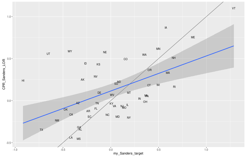
Not surprisingly, the Cook Report and I vaguely agree (along the diagonal), but some states are fairly off. This is probably due to many different things, the most important of which might be how I measure liberals. The second is that I am using log-odds ratio, which they probably didn’t.
Future updates
Within the next week, I will copy both the targets and the national polls posts into their own, regularly updated pages. On those pages, I will keep using the Cook Report’s, these estimates and any future ones I may produce. At the end of the primary, I hope to have some meaningful conclusions about this process. I will update the pages with what conclusions I will draw depending on what results we get.
#Save our work!
targets <- data.frame(state = dem_primary$State,
                           my_Sanders_target = dem_primary$my_Sanders_target,
                           my_Clinton_target = dem_primary$my_Clinton_target,
                           CPR_Sanders_target = dem_primary$CPR_Sanders_LOR,
                           CPR_Clinton_target = -dem_primary$CPR_Sanders_LOR)
write.csv(targets, "2016-dem-primary-targets.csv", row.names = FALSE)
Further research
I hope to always include (and will retro-actively) a further questions section to these posts.
- This is not the first two-candidate primary, there is a lot of historical data to be mined, with the same analysis
- Age and income have been noticed as large dividers in the race, would they yield better targets?