Playing around with HuffPollster data
Today, I learned that the Huffington Post allows one to download its data! Even better, someone wrote a library to do it for you!
This allows the gathering of a lot of data really easily, although it can take a while. The following gathers all data for the 2016 primary for the democrats (the republicans are too much of a mess), including all national and state polls. Whoosh, data!
d_polls <- pollstr_polls(topic = "2016-president-dem-primary", state = "US", max_pages=500)
length(d_polls$polls[,"id"])
## [1] 267So now, we can make cool plots, that look just like the ones the Huffington Post makes, except for the fact that I can plot them however I want :)!
- using weighted moving averages
- a poll is not (usually) conducted over a single day, but a range
- plotting empty space for the future
- plotting the popular candidates
- I don’t like percentages much, I significantly prefer log odds-ratio
The democratic race is a lot easier to play with, at least in terms of number of candidates. In addition, I’m going to be bringing up the Clinton-Sanders target into play in a second, and this analysis is currently impossible on the Republican side.
d_candidates <- c("Clinton", "Sanders", "Biden", "O'Malley")
d_questions <- subset(d_polls[["questions"]], question == "2016 National Democratic Primary" & choice %in% d_candidates & value > 0)
d_polldata <- merge(d_polls$polls, d_questions, by = "id")

p <- ggplot(d_polldata, aes(x = end_date, y = log(value/(100-value)), color = choice)) + xlim(as.Date(c("2015-01-01", "2016-11-05")))
p <- p + geom_point(alpha = 0.2)
p <- p + geom_smooth(span = 0.5, method="loess")
p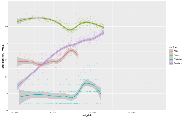
However, by itself, this is not particularly interesting: at a national level, most people have not payed enough attention to have a serious opinion. This probably works in favor of Clinton, but Sanders might also be benefiting from a “cool” effect. I don’t particularly want to speculate on which effect is larger, but I do want to bring in data from voters who have made up their minds: Iowa and New Hampshire.
The only issue is that any one state is hardly a “representative sample” of the country. However, we already have a measure of the bias of each state: how well they need to do to be on track for the nomination. To adjust, because we’re in log-odds ratio space, we’re simply going to take the LOR difference between target and performance, and… nope that’s it, we’re done!
(O’Malley also dropped out)
results <- data.frame(state = c("Iowa", "Iowa", "New Hampshire", "New Hampshire"),
                      date = as.Date(c("2016-02-01", "2016-02-01", "2016-02-09", "2016-02-09")),
                      choice = c("Clinton", "Sanders", "Clinton", "Sanders"),
                      value = log(c(49.86/49.57, 49.57/49.86, 37.95/60.4, 60.4/37.95)),
                      target = log(c(13/31, 31/13, 9/15, 15/9)))
p_states <- p + geom_point(data = results, aes(x=date, y = value-target, color = choice, label=state), shape=18, size=5, alpha=0.7)
p_states <- p_states + geom_text(data = results, mapping=aes(x=date, y = value-target, color = choice, label=state), hjust=-0.2)
p_states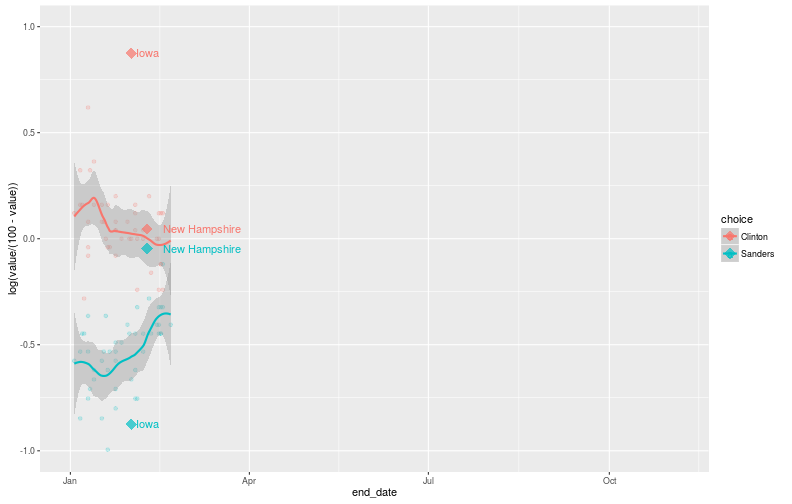
This doesn’t tell us much (yet!), but these new points probably tell us something about how the rest of the country is going to vote, assuming nothing changes. However, both data points don’t seem to agree much. New Hampshire might be benefitting from an Iowa bump, but I’m not convinced of that explanation, especially given its magnitude. I’m dubious of the fact that Iowa is ranked as friendlier to Sanders than New Hampshire is. If it were the other war around, the points would agree with each other better.
This, along with the previous post, point to a clear path forward: run my own targets, and use those instead.